Review: Strathmore Gray Scale and Pastel Paper Pads (400 series)
Today, I'm reviewing two Strathmore drawing pads - the 400 Series Gray Scale Paper and Pastel Paper.
I bought these two because I had good results with the Canson Mi-Teintes Pastel Paper and wanted to try other types of toned paper. The Strathmore ones are affordable and came with a large range of colours, so they appealed to me.
After using them in various ways, here are my thoughts:
Specifications
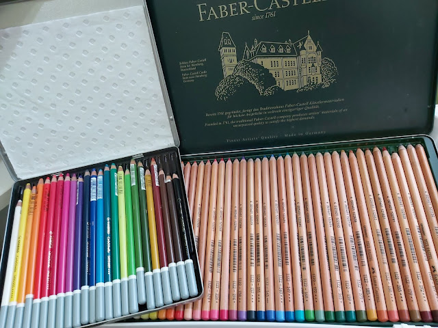
This is what they look like. I have both of them in the 9x12 inch size, which is slightly larger than A4.

The Gray Scale Paper is a very thick paper at 216gsm and comes in a pad of 15 sheets. Even though it says gray scale, two of the five colours are white and black so technically, it's only three shades of grey, which I do feel is a bit of a cop-out. You get three sheets of each colour.

The Pastel Pad is a thinner paper at only 118 gsm. I was drawn to this because of the variety of interesting tints. You can only see five in this picture but there are actually six - cream, yellow, beige, tan, green and blue.

Both are acid-free paper and part of the 400 Series which is the best grade paper for Strathmore.
Performance - Strathmore Gray Scale Paper
The Gray Scale pad is decribed as a "heavyweight textured surface" for dry media. I really wanted to like this paper. It feels thick and luxurious and looks like it would be perfect for coloured pencils. But that texture! It's rough and in my opinion, not in an attractive way like with the Canson Mi-Teintes. With coloured pencils, I can't get a crisp line at all. This is a close-up shot of a street scene I drew. The lines turned out fuzzy and crooked.

Layering on this paper is also tough. The coloured pencils don't go on smoothly and after just a couple of layers, it's hard to get any more pigment on the paper, which is surprising considering how much tooth this paper has.
Another con: it doesn't take water well. Most dry media paper, especially of this thickness, can at least take light liquids from watercolour pencils or solvents. This one doesn't. I used some water for the watercolour pencils and the paper buckled almost immediately.
Determined to try and make it work, I then drew this zebra on the back side, hoping the texture would be better. It was...slightly. The back is a honeycomb texture and lends itself to sharper lines with coloured pencils. However, I had the same issues with layering. Just a couple of layers and the paper becomes very slick, making it hard to lay down any additional colour.

With dogged determination, I tried again (I still had so many sheets left, I wasn't going to waste any!) I thought, ok, no go for coloured pencils, maybe pastels? So I drew this otter in pastel pencils using the front side.

Same problem with the texture - the otter looked like it had leaned its face against a metal grate, and it was impossible to get thin lines for the whiskers.
So my verdict? I tried, I really did. I wanted to like this paper. But it falls short in every possible way and is generally frustrating to work with. I don't recommend this for coloured pencils or pastels. So even though it claims to be for dry media, the only medium I would possibly use this for is pencil. I drew a mynah on the white sheet and it turned out ok.

Still, there are way better and cheaper options for pencil drawings. The one that comes to mind is the Strathmore 400 Series Drawing Paper, that's a MUCH better paper for drawing. You can read my review of that paper.
Performance - Strathmore Pastel Paper
The Pastel Pad is described as "heavyweight" with a "textured finish" for oil pastels and dry pastels.
I'm scratching my head a little at this description because this paper is hardly heavyweight. In fact, it's pretty lightweight, especially where pastel paper goes. Most pastel paper I know is at least 160gsm. This one is only 118 gsm and it shows. Even though there is some texture, it's too smooth for pastels, in my opinion.
In this drawing, I used pastels for the background and coloured pencils for everything else. It's very difficult to blend pastels on this paper. The tooth (or lack of it) fills up quickly, making it practically impossible to lay down new layers. I used my fingers to blend the colours and practically sanded my fingerprints away!

Ironically, even though this is sold as pastel paper, it works better for coloured pencils. However, this paper has the same problem as the Gray Scale Paper in that you can't really layer much. It gets slippery quickly and then you have to press really hard to get additional layers on It's also too thin for liquids so I had to use solvents sparingly.
Conclusion
Unfortunately, both of these papers fell short for me. If I had to choose between them, I would choose the Pastel Paper because it at least has interesting colours and creates an interesting effect, especially with the tan paper. |
| Coloured pencil on Strathmore Pastel Paper |
Both can't take many layers which makes them not a good choice for either coloured pencil or pastels, though at least with the Pastel Paper, you don't have to fight the texture at the same time! Also per sheet, the Pastel Paper is cheaper than the Gray Scale Paper (but it's very thin).
If you want toned pastel paper at an affordable price, I recommend Canson Mi-Teintes instead. It's slightly more expensive but there's a vast difference in quality.
Afternote: I've since tried Strathmore Artagain tinted paper and I absolutely LOVE it for pastels. This is a great affordable option to the Canson.
You can read my review of both the Canson Mi-Teintes and Strathmore Artagain paper as an option for pastels.


I thought your review was very interesting, I just got this paper and already love it! I have yet to do a full drawing though. But my Prismacolors blend really well, I got a lovely grey using just black and white. They're very smooth and vibrant too. I'll see how good the layering is though!
ReplyDelete