Blue koala in pastels
My family and I were arguing about whether a koala is a bear (it's not) which led to me painting this:

I found a great photo reference on Pixabay and thought all that fur would look nice on Velour paper. This painting took longer than usual because quite a few things didn't go the way I planned.

I started with the bokeh background using soft pastels. I've done plenty of bokeh backgrounds, shouldn't be a problem, right? Well, it looked wrong. Instead of looking like blurred out lights, the spots looked like a swarm of fireflies had descended on the koala's domain. I tried blurring them out more but that didn't work either and only muddied the bright lights.

In the end, I decided maybe there were too many spots and covered over some of them in the bottom left area. Still not feeling it, but I decided to move on.

I coloured the leftmost branch using mauve tones and found that I really liked how it stood out. Maybe that will detract from dem fireflies.

Next was the koala. I decided that I would give it a green-blue undertone, with a dash of pink for the inner arm. Used PanPastels for this.

Next: colour in the koala. I used mostly NuPastels, Jack Richesons and Rembrandts because I know from experience that the firmer pastels work better for fur details on Velour. I coloured in one ear. So far so good.

Then I coloured in half of the face and the problem started. I hated it. It looked like a Blue Meanie gone wrong. So I added some pink, not sure it's helping. Now it looks like a Blue Meanie with pink makeup. Did the eye and like that, but am starting to think this painting might bomb.

If there's one thing I learned from pastel painting, it's not to focus too long on one section as you tend to lose sight of the whole picture, so I moved on to the nose. Ok, I think that's an improvement, but still not feeling the blue.

So I worked on the rest of the koala's face, making sure the right side is lighter to show contrast between light and shadow. You know what? It might be ok afterall. I do like the eye.

Moving on to the body. AAARRGHHH.... I hate it! Why does it look like it's wearing a John Travolta jacket?

After this part was lots of working and reworking on the koala body. The problem was that I couldn't decide whether I liked it more blue or more pink, so I kept layering colour on top of colour. My indecisiveness always trips me up. This piece was definitely overworked, but I guess it could have turned out worse.

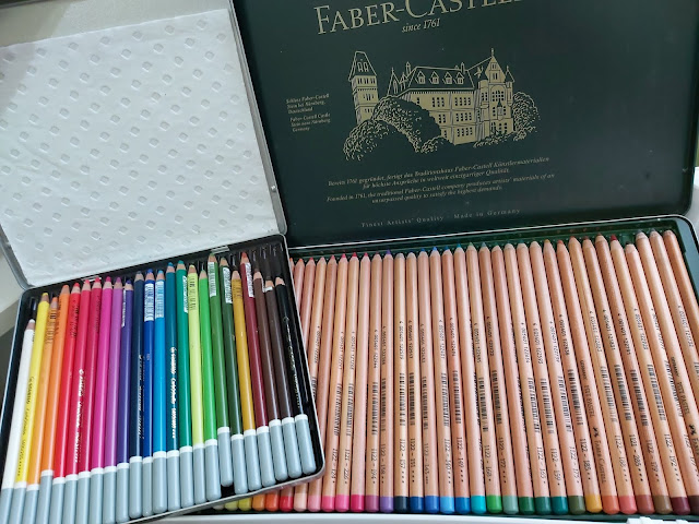
And then it was filling in the rightmost branch. On hindsight, I should have made the highlights pink, not yellow, to match the other branch. Oh well, whatever. Live and learn. Here's a pic with some of the pastels I used for the koala.

So here's the final painting, It really is very blue. When I paint animals, I don't aim for them to be the most realistic, but I do want them to have life. Have I succeeded with this koala? I don't know. But I bet it detracted you from the fireflies.


Comments
Post a Comment