Tabby kitten with Jack Richeson soft pastels on Velour
This painting was inspired by Emma Colbert's demo of a cat painting. Reference photo was from PaintMyPhoto.
 |
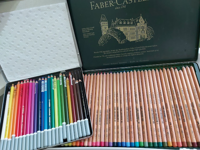
I really wanted to give Velour paper another go because Emma's animal portraits on them are so beautiful but I could never seem to get the details that she can. In case you don't know what Velour paper is, it's a special type of paper for pastels by Clairefontaine that has a furry, velvety surface. My previous painting on Velour of otters turned out to be fuzzy. After watching a few of Emma's videos, I realised I did several things wrong. Mainly, I had used Sennlier and Schmincke pastels which are way too soft for Velour. So for this painting, I decided to use slightly harder pastels.
First, I followed her tutorial of using a harder black pastel to mark in the dark areas. I don't have the Faber-Castell Polychromos that she does, so I used my NuPastel black instead. It works fine. Then I put in a blue background. Because I used a brown Velour paper, the blue kept having a dirty tinge. It was only after many, many layers that the brown stopped showing through.

Moving on to the eyes. I used soft pastel sticks but had to use pastel pencils for the teeny details.
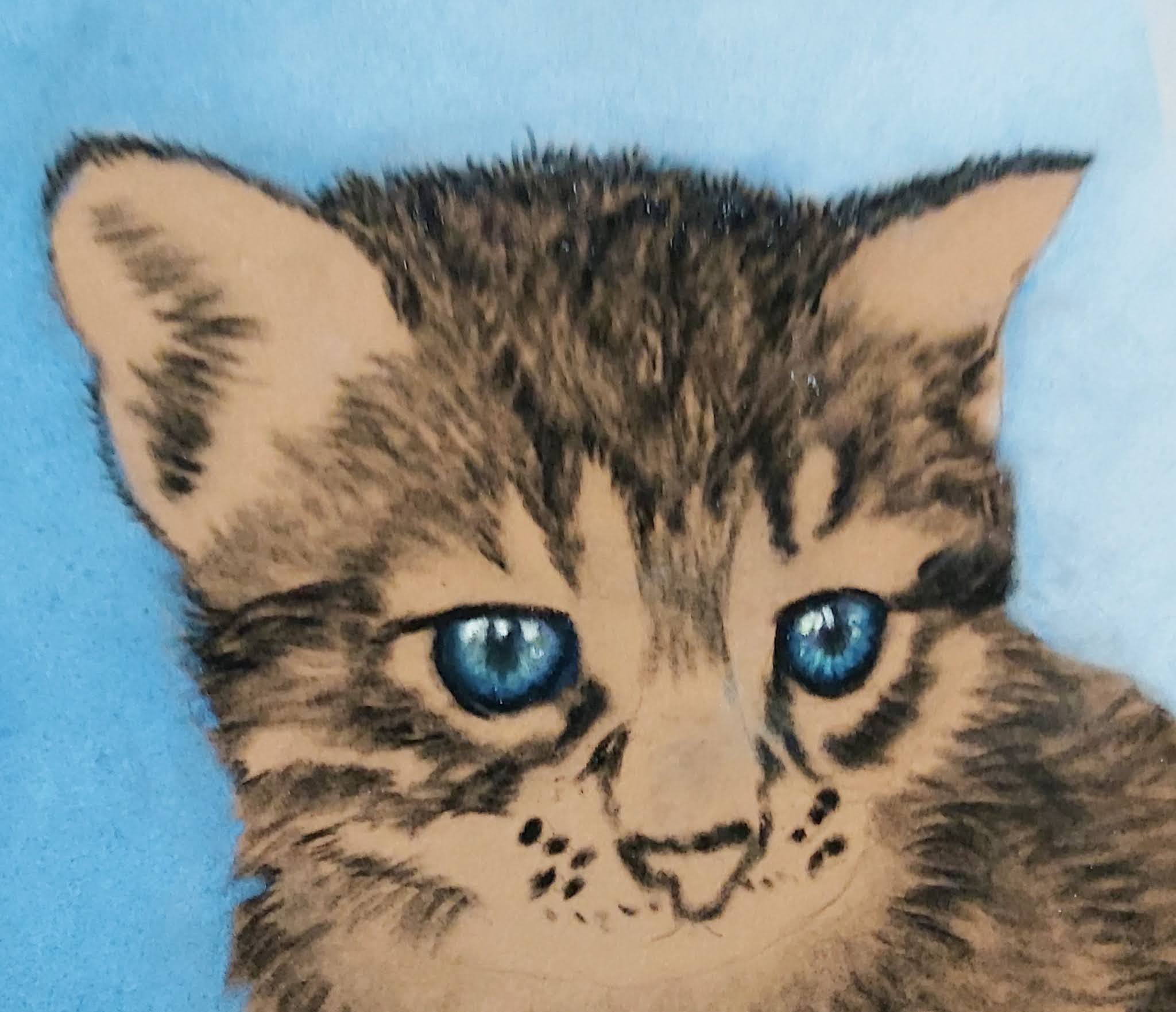
Then I drew in the fur details and at this point, I found that I couldn't work with the Unison pastels, the marks just went on too fat and chunky. After some experimentation, I found that my Jack Richeson pastels gave me the best results - able to make more detailed markings but still with reasonably vibrant colour. Am starting to be optimistic that I might actually make this work!

When I was more or less done with the cat's face, I stepped back and felt that the blue background was too plain and one-dimensional. So I added some bright pink splashes with my Mungyo Gallery soft pastels. MUCH better. I ♥ pink!

Then it was the finishing touches - lightening the whites with my NuPastel white, and drawing in the whiskers with Koh-I-Noor White Coal pencil.

Final thoughts:
There is a learning curve to using Velour - it's less forgiving with mistakes than say, Pastelmat or UART. I find that I don't have the skill level to use Unisons on Velour - it gives too fuzzy an effect. Jack Richeson and NuPastel work well, though I prefer the former as the colour payoff is better. Emma Colbert's technique of using a harder pastel to mark the dark areas first works really well.
Blending is also trickier. I found that after many layers, the soft pastels would smudge very easily. The slightest movement would leave a streak, so I would be nervous about not using a fixative on this, unlike with Pastelmat.
However, the unique feature about Velour is that it gives animal portraits a super soft look. The velvety texture of Velour makes fur actually look like fur, so much so that you want to reach out and touch it. It's simply beautiful. You can't get this same softness with Pastelmat.
For this reason, Velour will continue to be part of my arsenal for now. If you draw animal portraits, I feel it's worth the time investment to learn how to use this paper.


Comments
Post a Comment