Christmas Gift Art Challenge 2 - Faber-Castell 36 Pitt Pastel Pencils
Part 2 of my personal challenge of creating an artwork using each of art supplies I received for Christmas! Part 1 was Faber-Castell 36 Polychromos coloured pencils, and this second one is the Faber Faber-Castell 36 Pitt Pastel Pencils.
I drew a dog with this set and I love the final result but looking at it, you might not realise that it took a couple of false starts to get here.

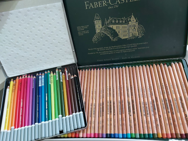
First, the pastel pencils. I have a few Pitt pencils that I bought singly, this is my first set. Very beautiful in the classic dark green Faber-Castell hinged tin.

For this challenge, I initially wanted to combine two art supplies into one. I'd received a 5-pack of PanPastel extra dark shades from my son, but since it's quite difficult to do an entire painting with just 5 dark shades, I thought I would combine them with this Pitt Pastel Pencil challenge by using them as the underpainting.

Clever eh? Or so I thought! That is, until I discovered that the Pitt pencils simply would NOT draw on top of the PanPastels. I was having the exact same problem as with the Polychromos coloured pencils. This surprised me because I'd used Strathmore Artagain paper and I could previously pile a few layers of pastel pencils on it without issue. I don't know if it's because the Pitt pencils are harder than the Stabilo CarbOthello pastel pencils that I previously used, but it proved to be an impossible task and I abandoned it at this stage.

I tried again. This time I used Clairefontaine Paint On black paper and just the Pitt pencils, no underpainting. MUCH better. The pencils went on smoothly...for the most part. For some reason, the Indian Red 192 went on super scratchy and unevenly, like there was a film around the pencil. You can see the effect here. I tried sharpening it, thinking it might be the outer layer but it didn't work. It was pretty frustrating, especially since there weren't a lot of browns in this set so this colour was critical to the drawing. Honestly, I'm surprised. I expected more consistency in quality with Faber-Castell. The other colours seemed ok, though I haven't used every single colour. I hope this is the lone rogue pencil.

Mid-way progress. I really have to remember to take more photos in the earlier stages. Quite satisfied with how it looked at this stage, but I'm not used to drawing on black paper which somehow tends to suck the vibrancy from pigments. The cream and yellow shades look very bright in the box but when drawn on, they tend to look very subdued on black. So I had to adjust for that by using brighter and lighter colours. The advantage of using black though, is that I don't have to completely fill all the whites of the paper. Any uncoloured bits just look like the undercoat of the fur.

And the final drawing. Actually, I haven't used pastel pencils in a while, especially since
I've been using mostly soft pastel sticks. It's a very nice change of
pace and I realise that I miss being able to draw all those teeny little
fur details.

As for the Pitt pastel pencils, they're wonderful. Except for that
Indian Red, the rest draw smoothly and give lots of control. The 36-pc
set gives a nice range of colours, especially the pinks which are often
lacking in other sets. Looking at the colour range with its predominance in yellow, pink and green, I imagine this set
would be great for drawing flowers and other botanical subjects. Perhaps something to try in the future!


Comments
Post a Comment