Review: Prismacolor Premier NuPastel Sticks
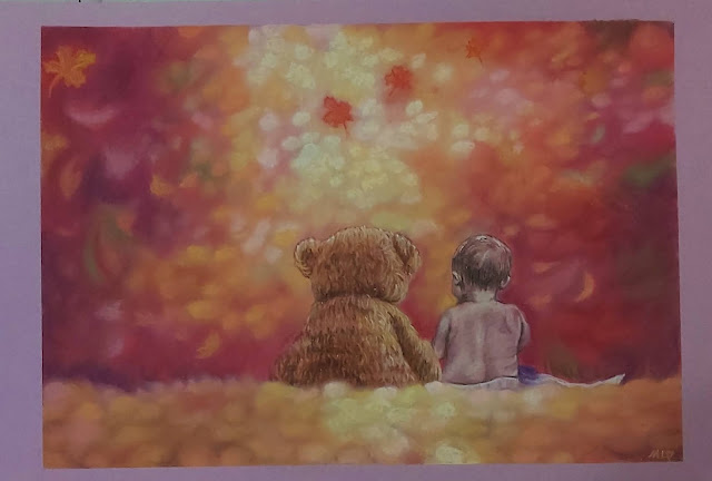
This was the painting I did over the weekend. It's very Hallmark card-ish, which is not usually my thang, but my son was home from National Service for a long weekend, so I was in a holiday mood.
For this piece, I broke out my brand new Prismacolor NuPastel set. To be honest, I wasn't planning on buying any more pastels, least of all hard pastels, because I have a small set of Sakura Nouvel Carre from 30 years ago and didn't like them. They're scratchy and chalky, and the pigment is muted.
But as always, my good intentions were thwarted when I chanced upon the NuPastel 96-piece set on Amazon a couple of weeks ago for only S$54 (about US$39). As you might know, Amazon works on surge pricing based on demand, so sometimes if you're lucky, you can come across great bargains. These usually retail from S$128 to S$200, so we're talking a hefty discount, less than half price. Plus many pastel artists rave about these pastels. So I caved. As always.
Aren't they gorgeous ♥ I reorganised the pastels though, sorting mostly the warm tones in one tray and cool tones in the other. I also made a colour chart and in doing so, I realised there's a pattern to the numbers: all the colours are sorted by their last digit, eg. browns end with 3, greens end with 8, blues end with 5, greys end with 9, etc. Not sure if this info is helpful to anyone, but thought I'd mention it.
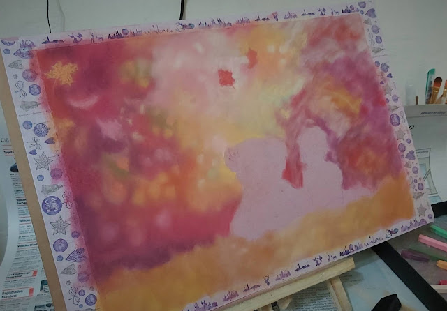
My plan was to draw the entire piece mostly using NuPastels, but it didn't quite work out that way. It started well enough - a light layer of PanPastels as underpainting, then I coloured in the background using NuPastels. First impressions: the NuPastels are nothing like the Sakura hard pastels. They're softer and more pigmented. I love the violet, peach and pink hues so much. I used Strathmore Artagain pink tinted paper for this piece and the NuPastels layered very well on it.
The trouble came when I tried to colour in the light spots, depicting the light shining down on the subjects. While the NuPastels are pigmented as far as hard pastels go, their lights are not as bright as I would like them to be. Even the lightest yellow showed up pretty muted, possibly because I'd already gotten quite a few layers of pastel down by then. In the end, I had to resort to using the softer Unison yellow and pink tints for the brightest parts, even though they did appear somewhat patchy on this paper.
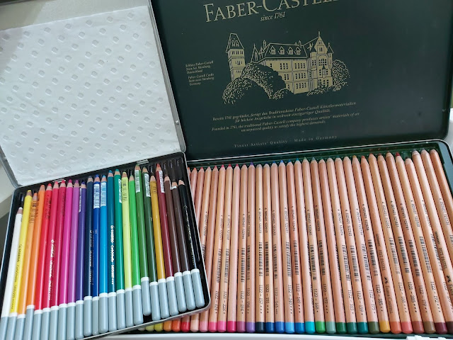
Another issue I found was that I couldn't get the super crisp lines I wanted for the leaves in focus with the NuPastels, so I had to whip out my pastel pencils for those instead. And I decided that I would use the pastel pencils for the bear and the baby as well.
Then I finished off the rest of the foreground and background with NuPastels.
I'm pretty happy with how this painting turned out, partly because it's not the type of picture I would normally attempt. I'm constantly trying to remind myself that painting shouldn't be about expecting a masterpiece each time. When I focus on the outcome, I tend to get stressed out and it makes me want to stick to "safe" subjects where I'm more confident. I want to be able to step out of my comfort zone and experiment as much as possible, even if I might fail, because that's the only way to progress and grow. I know this from my experience as a writer over 30 years - I believe art is the same.
As for the NuPastels, I'm glad to say that I love them. They're creamy and pretty pigmented, and I can see that they would be great for backgrounds. I like that they don't fill the tooth of the paper too quickly, so I can use them on unsanded paper.
In terms of hardness, vibrancy and ability to draw details, they're a perfect in-between bridging soft pastel sticks and pastel pencils. I find that soft pastel sticks and pastel pencils don't work well together, but NuPastels are the amicable companion, happy to play with either one. I'm naming this painting Forever Friends and I guess that aptly describes the NuPastels as well.


Thank you for pointing out that the color families end in the same number! That was so observant. I don't think I'd have noticed that for a long time. It really helped me with organization.
ReplyDelete