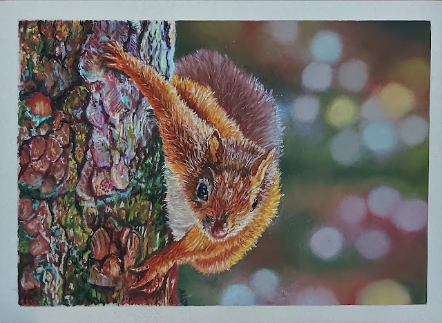
The psychedelic squirrel unveils an epiphany
This is my latest wildlife painting and I love it to bits because in the process of drawing it, I had two Eureka moments. Warning: this is a long post because I'm recording what I feel is special self-discovery moment in my art journey.
First, I discovered that this is the art style I most identify with. Not just animals or realistic animals, but animals through a technicolour lens.
I love colour in art. Bright, gaudy shades that make the world look like it's in Taylor Swift's ME! music video. This is evident in my early Spain project where I used alcohol markers to make my buildings so satured with colour that you'll almost need sunglasses. It's funny...in real life, I'm an introvert prone to brooding, and I'm certainly more drawn to shades of grey (not that one lah) than rainbow colours. Yet in paintings, colour makes me happy and gives an instant lift to my mood.
When I started the shift from drawing buildings to drawing animals, my colour palette became more subdued. I mean, wildlife usually doesn't come in bright hues - those animals would be the first to get eaten. Also, coloured pencils are more subtle in their hues than markers.
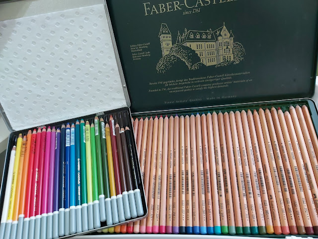
And then I discovered soft pastel sticks. I didn't think I would like them, especially the very soft ones. It's messy and the pastel dust gets everywhere. That's why I started with pastel pencils, because you don't get your hands dirty. Oh, last night, I dropped a soft pastel stick on the floor and it instantly shattered into a million pieces. At 2am, I was on my knees, trying to clean the pastel dust which had seeped into every single crevice in my parquet floor. So not fun.
But oh man, the colour. The intensity of soft pastel hues is just incredible. The yellows are blindingly yellow, the blues look like you're in Smurf-ville. The lights glow, and the darks give such a depth to the paintings. I can't replicate the richness of these hues with pastel pencils. So in spite of myself and eating my words, I grew addicted to soft pastel sticks.
Still, I didn't know how to tap into the potential of pastel pigment. When I drew the eagle, I realised I could ramp up the intensity of the colours for backgrounds. But it was still largely monochromatic. Up to this point, my backgrounds had been mostly in one tone. (Of course, all this sounds like it's taken place over years when in reality, it's only been weeks).
Fast forward to this squirrel painting. What drew me to the reference photo was the number of colours in that tree. I didn't know how I was going to replicate it, but I thought it would be an interesting experiment.
 |
| Photo: Dave Webb |
It turned out to be a painting infused with joy. I loved every minute spent on this painting. It was like all the colours of my soul came flooding out into the painting, and that's when I realised - this is me, this is my style. Animals in technicolour.
Which brings me to my Eureka moment no.2: I now love drawing backgrounds. This is no meagre evolvement. Not too long ago, I hated drawing backgrounds. To me, they were a necessary evil, just the backdrop for the main actor (cute animal). I guess that's why I never liked drawing landscapes, it's like one massive background piece. So for me, the background usually consisted of an out-of-focus block of colour, in one tone, perhaps with some graduation - something to get over and done with so I could move on to the main course.
But in drawing this piece, when I discovered that I could play with colour in the background, my perspective completely changed. The background became an open window of opportunity to create whatever I wanted. Instead of sticking to the dull grey tones in the reference pic, I used greens, purples, pinks, yellows, blues. (I used Schmincke and Sennelier soft pastels). This pic was when the pastels were just added, with light blending.
I felt that the shades looked too cool, so I added some red browns and started blending the colours in. I didn't know if using so many different hues would cause a massive colour clash, but I didn't care - it was SOOO FUN. When I finished, I was stunned by how good it looked. My daughter said it looked like Christmas lights.
Next challenge was the tree. Again, trees are not my thing. The branches I've drawn in the past are meh at best, nothing to shout about. But this time, I threw different coloured pastels at it with wild abandon. I really thought it was going to look a mess. When you do one small part, it always looks wrong - the lines, the colours. How can that lilac and sky blue look like part of a tree? It's almost a gamble what the whole will look like eventually.
I was on a roll. When I finally completed the tree and stepped back to look at it, I was blown away. It actually looks like a tree? How??
And then on to the squirrel. First, an underlayer in Panpastels, before filling in the rest of the animal with soft pastels and pastel pencils.
I went bold with the colour - I made the yellows yellower, and rust browns orange and made this squirrel look almost flourescent. And tah-dah...presenting the psychedelic squirrel.
A side note on the paper: I don't know if the result I managed to get was partly due to the paper. This was the Tim Fisher 400 sanded paper, the last piece of sanded paper in a sampler pack I bought, I wasn't expecting much as this paper is not really talked about a lot in the pastel community, but it turned out to be my favourite of the lot, which completely took me by surprise.
It has fine, even grit and it's the only paper I've tried which could take pastel pencils on top of a few layers of soft pastels. It's very forgiving and wonderful for layering. Colours just pop on this paper and everything goes on with tremendous vibrancy and intensity. It was simply a joy to use. It also creates very little dust - something about the paper that grabs all the pastel pigment. What a bonus! I love this paper so much, I'm bummed that I can't get hold of it. It's not sold in Singapore as far as I know, and shipping it from the UK would cost a bomb as it comes in very large sheets.
Final thoughts: This doesn't mean that from now on, I can do all paintings in
multi-coloured hues, of course. I still need to follow mostly the
colours in a reference photo. I haven't reached the stage where I can imagine what the
colours could be and whether they would work together. I think that
takes time and a lot of experience. But the discovery that this is what I want to create, is pretty exciting and such a gift. Thank you, God, for the joy of creating.


Coool, Man
ReplyDelete